Autonomous Vehicle Pedestrian Interaction
Autonomous Vehicle Pedestrian Interaction
- 3 -
Autonomous Vehicle Pedestrian Interaction Project
January 2019 – August 2019
Prototype
Work-in-progress
I investigated the efficacy of different external human-machine-interface in communicating autonomous vehicle (AV) intent to pedestrians in crossing situations where negotiation between the AV and the pedestrian is required (i.e. jaywalking). This research hopes to contribute to improve the perception of AVs and for the pedestrian to embrace new technological changes, instead of fear them.
Context
The dynamics of road users has evolved. The previous control and responsibility of the human driver shifted towards automated driving; however, the other road users have not changed as drastically in their behaviours. The most vulnerable road user remains the pedestrian. Despite a large number of design concepts suggested, no works investigated designs that explicitly illustrated the mental model factors that impacted pedestrians the most - the speed and the speed change (i.e. acceleration or deceleration) of vehicles.
This study attempted to bridge the mental gap between the perceived vehicle kinematics and gap estimation to the actual information by exploring visual design concepts to indicate vehicle speed and gap distance. The effectiveness of the new designs were compared to existing designs in academia and industry.
The Challenge
1. With driver-less, fully autonomous vehicles, how do external visual displays affect pedestrians’ crossing behavior and perceived safety levels?
2. With driver-less, fully autonomous vehicles, to what degree should the vehicle communicate its intent with pedestrians?
Design Criteria
After a comprehensive literature review of designs that exist up until 2019, there were four main criteria that were used to construct the new design concepts to explicitly display vehicle kinematics to pedestrians. The criteria are:
Indication of whether the vehicle is in autonomous or manual driving mode
Immediate future state of the vehicle
Signal that replaces the eye contact signal
Inducing of a calm crossing experience
This is a perception study into understanding attitude of pedestrians towards different design concepts. The designs were exploratory and were based on three design theories: color’s impact on behaviour change, symbolism of speed, and warning design.
Experiment Design
I conducted an Amazon Mechanical Turk study with 100 participants, primarily from the US. There were 28 different stimuli and one baseline scenario with no designs included. The stimuli were structured into 14 (Design cases) x 2 (Coloured vs. Non-coloured Designs) factorial design. Three novel design concepts were introduced - visually displaying explicit vehicle kinematics, gap acceptance, and time-to-arrival. A combination of iconography, text, anthropomorphic features, and colour were compared and investigated.
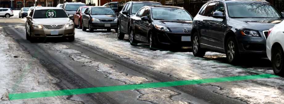
No other study studied the effect of adverse weather on the perception of designs in this context. The series of photographs were taken on a weekend afternoon in the midst of Canadian winter: -3 degrees Celsius after a night of freezing rain. There were frozen snow and ice residues of ~ 0.5 inches in thickness left on the vehicular road. A series of three images were captured; one where the vehicle is approximately 150m away, one where the vehicle is approximately 75m away, and one where the vehicle is directly in front of the pedestrian. Short animation videos of 1080p videos were created and uploaded on YouTube.
Ambiguity in crossing decision was induced. The location selected reflected this - the street was a one-way street with no visible road signs, zebra crossing, or traffic lights in the section photographed. The only decision on pedestrian crossing is on the pedestrians’ on mental mapping of safety.
SAM Questionnaire, Lang, 1980
Measures
The primary measures included in this study derives from theories and empirical studies in the field of warning design and evaluation. Typically, many of the warning studies are subjectively evaluated in several dimensions on a Likert-type scale. For subjective measures, perceived safety, perceived urgency, perceived usefulness, perceived understandability, and emotional response were collected from participants after each scenario. Perceived urgency was to be rated on a scale of 1 to 100 for maintaining data consistency for result comparison with a relevant study from the same lab. Perceived safety, perceived understandability, and perceived usefulness were rated on a Likert scale of seven. The emotional state was measured using a Self-Assessment Manikin (SAM) questionnaire. SAM is an emotion assessment tool that uses graphic scales, depicting cartoon characters expressing three emotion elements in rows, and they are, in order: pleasure (level of contentment with the interaction), arousal (level of calmness felt during the interaction), and dominance (level of control felt during the interaction).
Design Consideration
Color’s vs Noncolour Design
The general population of Canada and the U.S. has been publicly educated on the meaning of red, green, and yellow in the context of street safety. As a result, these colours are effective as visual indicators for safety to the average North American. However, as of 2019, The Ontario Highway Act (1990) does not permit the use of certain colours, such as green and red, to be emitted from lamps attached to conventional commercial vehicles. Therefore, non-colour designs removed all the banned lamp colours and the rest of the design elements remained the same.
Symbolism of Speed
Applying the linguistic theory of pragmatics (theoretical definition of visual designs based on its functional purpose and the user’s needs), a comprehensive review of the taxonomy and visual evolution of analogue and digital dials for speed reading was conducted by Mitchell (2010). The visual machine interface of the information graphics – the symbolism, visual variables (shape, size, colour, etc.), reference points, scale, and iconography used - for the reading of speed and speed-related status information was acutely explored.
There are many design features to consider for speedometer designs: dial shape, reference point placement, rotation direction, scales, typefaces, number of placements, needles, and colour considerations (Mitchell, 2010). For this research, dial shape, reference point placement, rotation direction, scales, and typeface were focused as key design features required to empathize with the needs of pedestrians as users.
Warning Design
The goal of an effective warning design is to find the optimal balance between the level of annoyance and level of urgency for the user through the design stimuli. Iconography is used through the new designs. Pictorial symbols have been shown to improve the memory recall of warning information. In terms of comprehension, there have been international standards set for pictorial warning design to meet for the general public’s safety. ISO 3864-2 (Organization of International Standards, 2016) and ANSI Z535 (American Nation Standards Institute, 2017) sets the minimum acceptable levels of comprehension by the general population at >67% and >85%, respectively.
Designs
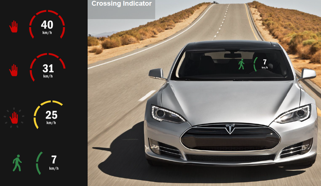
There were three novel design features that were included in this study that hasn’t been discussed and evaluated previously. External speedometer, speed change indicator, and gap estimation count down timer. Designs that performed strongly in other studies from both academia and industry were included to be presented in the same fidelity and contest for comparison of performance.
Novel Designs


Single Information Source


Dual Information Source


Impact
Influence of Colour
Colour is confirmed as an important criterion to be considered for designers to make better sense of the different gender gaps that exist due to perception. Across all measures, designs with colours were predominantly more effective in perceived urgency, perceived safety, perceived pleasure, perceived arousal, perceived dominance, and perceived usefulness, and perceived understandability than its non-colour counterpart.
Novel vs. Existing Designs
It was hypothesized that the three novel singular information source design concepts included in this study (external speedometer, time-to-arrival countdown, and speed change indicator) would outperform existing design paradigms (iconography, explicit text indication, anthropomorphic features, etc.) The hypothesis was rejected entirely. However, using a novel design concept, such as external speedometer, as an additive feature was found to be a novel effective design concept.
For AV pedestrian interaction in North America, with English as the language of choice, design elements of iconography and explicit text with egocentric messaging are affirmed to be the two most clear and useful single information source for AV-pedestrian design. In terms of design comparisons, designs with anthropomorphic features was not perceived as safe and as comforting to the pedestrians than previous postulated.
Influence of Additive Features
Single information source novel design concepts did not perform as strongly as initially hypothesized. However, using a novel design concept, such as external speedometer, as an additive feature was found to be a novel effective design concept.
Coloured external speedometer with WALK/ STOP text display - ranked 1st in perceived safety and perceived pleasure (most pleasant) and 2nd in terms of perceived usefulness and perceived urgency. The coloured case for an external speedometer with WALK/ STOP icon display – ranked 1st in perceived dominance, where the participant felt the most in control of their decisions to cross or not to cross.
Correlation of Measurements: Most Informative Measure
One of the key considerations of experiment design in the current study is to apply the lowest acceptable threshold in both design fidelity and research survey for scalability and reduced time and resource cost. The strongest positive correlation between individual measurement rank and summative rank is from perceived understandability. Perceived safety was second most informative as a single measurement for future research requiring heuristic evaluation; perceived usefulness being the third most informative.
Reflections
From the results, it can be concluded that AV pedestrian intent communication remains vital and the mode of the communication will have to adapt. The conventional design paradigm, in terms of lights and honking, used by manual vehicles of today will not be sufficient in order to improve or even maintain the lethality rate of pedestrians on roads.
In the next phase, I would conduct a follow-up behavioural compliance study would be the logical next step. Using a realistic VR simulation would further investigate the most effective display designs in behavioural compliance of crossing decisions.


